
As important as it is to celebrate and examine the best product design, we can learn just as much from failures. Let’s start by taking a look at one of the most interesting products of the last few years, Wildcard, and see where it went wrong.

Wildcard wants to solve the problem of poor mobile web usability by turning the entire internet into natively-rendered cards. Its founders predict a future where pieces of web content are simplified, stripped of chrome, and encapsulated in these cards. Given the current ubiquity of the card UX pattern, in addition to industry movement toward componentization (as is evident in the growing adoption of technologies like React JS), this is a forward-thinking prediction about one potential direction of the web. If successful, Wildcard will move cards forward from a UX pattern to an actual medium. The Wildcard app itself is intended to be a browser for this new card-ified web, and the company has created APIs for content producers to turn their web pages into cards for the Wildcard browser.
But since Wildcard’s launch last November, the app has suffered from a major problem. A product has to do something useful, and Wildcard (V1) did not.
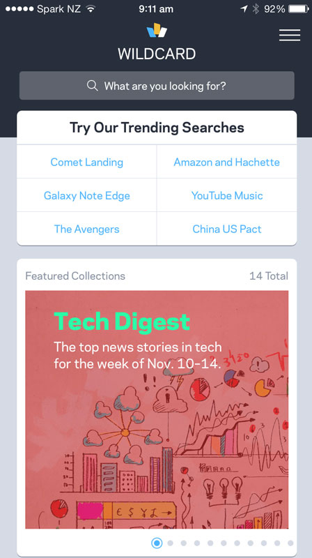
Above is the launch version of Wildcard. The home view features a curated “collection” of cards, a list of search suggestions, and a search bar with the enigmatic query: “What are you looking for?”
The helplessness of that question is an unfortunate signifier for why Wildcard isn’t successful today. What, exactly, is a user supposed to do with this app? On the real web, a user knows to enter a full URL in the address bar to get where she wants to go. Alternatively, she uses a search engine to find what she’s looking for. Wildcard, however, neither enabled address bar-like functionality, nor presented itself as a search engine. Although Wildcard aimed to replace the mobile web, users opening the app for the first time had no idea how to use it to achieve what they would normally do with a traditional browser.
If this wasn’t a confusing enough start, a number of other product decisions impeded any useful functionality Wildcard might have provided. Despite convenient encapsulation of content, cards could not be saved. The only way to make an account - which ostensibly could have been used to share cards across devices - was to make a purchase through Wildcard first. Limited functionality for purchasing products through cards was in place, but the feature wasn’t compelling compared to the easy navigability of the open web, and felt out of place in an otherwise content-driven product. In short, Wildcard completely lacked focus.
In retrospect, the value proposition on Wildcard’s original launch site is a telling indicator of the product’s weaknesses.
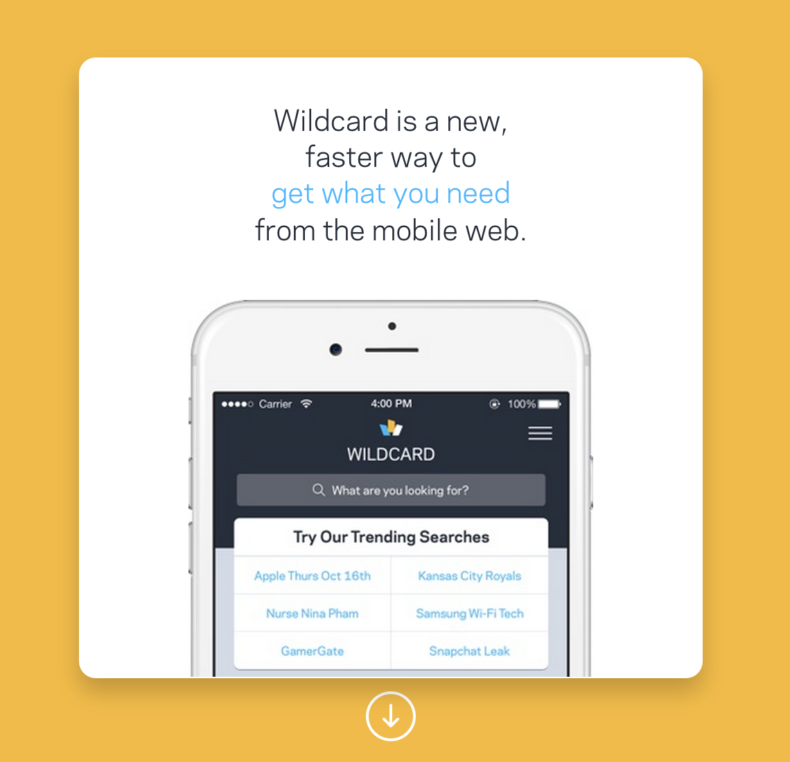
This incredibly vague statement is a value prop? But wait, what does the product actually do?
Better…barely. This second statement is much closer to showing the value of the product itself. But taking another look, this is nearer to Wildcard’s mission statement than an explanation of value to the user. Why is this immediacy great? What can users do with the product? Ultimately, potential users need to know why the product will benefit them. The lack of focus in Wildcard’s product and marketing exhibits their inability to find a compelling use case.
This is the lesson of Wildcard’s failure. They pursued their ambitious goal by creating a browser and a card-making API, attempting to start by directly creating the ecosystem they envisioned several years down the road. They succeeded in creating the card-browsing environment and tools to make the cards, but failed to offer a reason to use it.
##Wildcards That Could Have Been
It’s interesting to think about what a successful launch version of Wildcard might have looked like. What are possibilities for products with a refined focus that made use of Wildcard’s technology and laid the groundwork for an expanding collection of functionality that could grow into the complete vision?
One option would have been to start with what is now Wildcard 2.0, a news-reading app. The best part of the company’s technology is the ability to turn webpages into card-ified pieces of content à la Readability. A new read-it-later app with cards rather than pages as the predominant navigation paradigm, with the added ability to search for and save new articles-cum-cards, could have familiarized users with the notion of web content inside cards. Better yet, Wildcard could have positioned its cardification API as a successor to the aging but still-popular RSS protocol. By embracing similarities between the two services in the context of a read-it-later app, and by leveraging the idea of a technology upgrade, the company could encourage adoption by both content producers and end users.
Alternatively, in light of the recent hubbub about ad-blocking and the open web, Wildcard could also have marketed itself as “The Browser Without Ads”. In the current environment of anti-advertising sentiment, users might have flocked to Wildcard for the promise of a simplified web of ad-free content. The search bar could have been a true address bar, but in lieu of loading a full web page, surfaced individual articles or content pieces as cards. Enough users switching to Wildcard would encourage content producers and merchants to work directly with Wildcard to receive analytics and user data, and make their content easier to access.
By starting with a simple, focused product, then growing the user base and adding more types of content over time, Wildcard could have eventually achieved its long-term goals. Unfortunately, Wildcard turned out to be a victim of Gall’s Law:
“A complex system that works is invariably found to have evolved from a simple system that worked. A complex system designed from scratch never works and cannot be patched up to make it work. You have to start over with a working simple system.”
##Being Open About Failure
Wildcard is, in many ways, a failure nobody is talking about. Perhaps the reason for this is the massive excitement it generated early on, or maybe it’s our industry’s unwillingness to level critique the well-known, accredited individuals that make up their team. Whatever it is, Wildcard has been quietly failing for nearly a year, and nobody seems to be acknowledging it. Even Khoi Vinh, in his post about Wildcard’s new design and direction and subsequent post about leaving for Adobe neglected to mention why these changes to Wildcard were necessary and the true reasoning behind his departure.
Be it willful ignorance or embarrassed silence, there’s a lack of conversation about Wildcard. Instead, let’s embrace and discuss failures like these, so we can avoid being led down the path of complexity, and learn to make our most ambitious ideas reality.