
For a short time in 2014, one mobile app represented the future of product design. It showcased the best of recent years of design learning, and embodied everything a digital product can be. That app was Order, by Square.

Order allowed you to order food and drink from nearby restaurants, then pick it up. It took advantage of Square’s large network of restaurants and cafes that use its iPad point-of-sale product Square Stand. Businesses with Order enabled could take orders remotely through the app, which used WiFi and Bluetooth to alert the storefront when the user was nearby. The item ordered could then be prepared and ready for when the customer entered the store - a person could simply walk into the shop, say their name, and pick up the item waiting for them. It was a seamless little bit of user experience, with the tip even being included in the purchase beforehand. In this entry, I’ll be focusing on the design of Order, which I’ll approach in two layers.
The first of these layers is the interface. Many of the wonderful minutiae of Order’s user interface have been highlighted by Brian Lovin on his Design Details post, which has video versions of some of the elements I’ll mention here.
The second layer is elusive and not easily explainable. It has to do less with questions of usability and aesthetics, and more with intangibles like humanity and emotional connection. In that section, I’ll try to explain what Square Order had that other products don’t, and why it’s important.
~
##Interface
Order, may it rest in peace, seemed to be more of an experiment than a product designed for mass adoption. As pointed out by Brian Lovin, the app appeared to have been designed for the technology-literate type of user who understands novel interaction patterns. There are a number of these progressive patterns in the app, a great example being the login screen (again, see Design Details). That said, as a whole, Order has best-in-class information architecture that precisely executes its function of directing the eye to the right pieces of the interface.
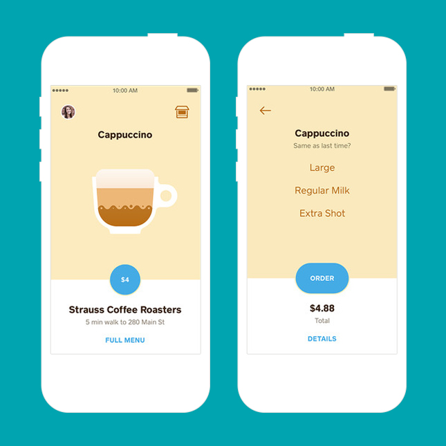
The main view, which highlights menu items from different local restaurants and cafes, is a great example. The main focus is placed on the item to be ordered, usually graphically represented with an illustration and taking up the bulk of the screen. Interactive elements are denoted with blue, the most eye-catching of which is the order button, which also doubles as price indicator.
This button is actually the one of the few traditionally-styled button in the app. Square is incredibly successful with using text buttons and familiarizing users with them. Many products still fall back on heavily styled buttons and dividers to denote interaction, but Order’s consistent color use on unstyled text buttons ensure that even a novice smartphone user would be able to come to grips with the interface quickly.
I can’t emphasize enough the importance of consistent interface and interaction patterns. Consistency affords users information and familiarity with how to interact with new screens. Throughout the app, Square uses this vertical division with the warm tan above as the primary focus, and a white section below for details. Putting the most important button in the app on the center of this division is a stroke of genius.
Excellent transitions and animations are also crucial to the success of this app. Interacting with of Order never feels like opening a new context; the proportions of the tan and white sections are merely adjusted to reveal information, as if it was just off the edge of the screen. Through these transitions, the layout simply “makes sense” in a way that few other products do - as if someone organized the app on a 2D plane while designing it. As a result, the navigation of the product is very easy to understand without thinking. Things simply go where you expect them to.
Square’s design team is well-respected, and it truly feels that with this app, they let their designers do their best work so far. It incorporates excellent color theory, takes advantage of HCI fundamentals, and uses advanced animation techniques. But using this app made me feel that Order’s designers didn’t just set out to make a pretty and usability forward product. There’s something about Order that elevates it to a rarer echelon of product design.
##Sub-Pixel Values
Although I’m about to try to derive the essence that makes Square Order great, I must confess that I don’t yet have a good way to categorize it. From the first time I used the app, I felt that there was something highly compelling to it, and that the user experience was far more than the sum of its parts. This app made it incredibly useful to do what it said it would, and made me want to use it again. When I first walked into a cafe to find a cup of coffee waiting for me with my name on it, I actually laughed out loud at how effortless the whole experience was. And when I put the phone in my pocket, I felt something akin to comfort - like I knew I had a tool that would simply work.
I want to reference two essays, one by Frank Chimero and the other by Ryan Tanaka, which begin to approach the characteristics that make this feeling possible. These writers have concerned themselves with the improvement of digital product design as a whole.
Perhaps famously, Frank Chimero stakes a claim in the subject in his essay “What Screens Want”. Chimero notes how the great modernist designers of the 20th century were obsessed with utilizing a given material to its greatest potential in the design of products. He reasons that for us in the digital field, the most fundamental characterist of our material, the screen, is what he calls “flux,” the inherent capacity for change. According to Chimero, by using this capability to its utmost, we can design honest, human-centered products.
Ryan Tanaka takes a slightly different approach in his 2014 Ribbonfarm guest post. In it, he discusses the concept of time as the missing axis of digital design. Time is a fundamental aspect of the human experience, but currently is not considered in the design of digital experiences. With examples like the way Windows 95’s startup theme and the dial-up internet sound came to define a generation and left lasting impressions, Tanaka points out that beginnings and ends are crucial moments in user experiences.
Where these two authors unite is in noting that we have the ability to control every variable in digital design, each axis of interaction with the user. We have an opportunity to make user experiences less standardized and more personal, more human. Both Tanaka and Chimero cite websites that change their designs from day to night versions as examples of how design can respect basic parts of human experience.
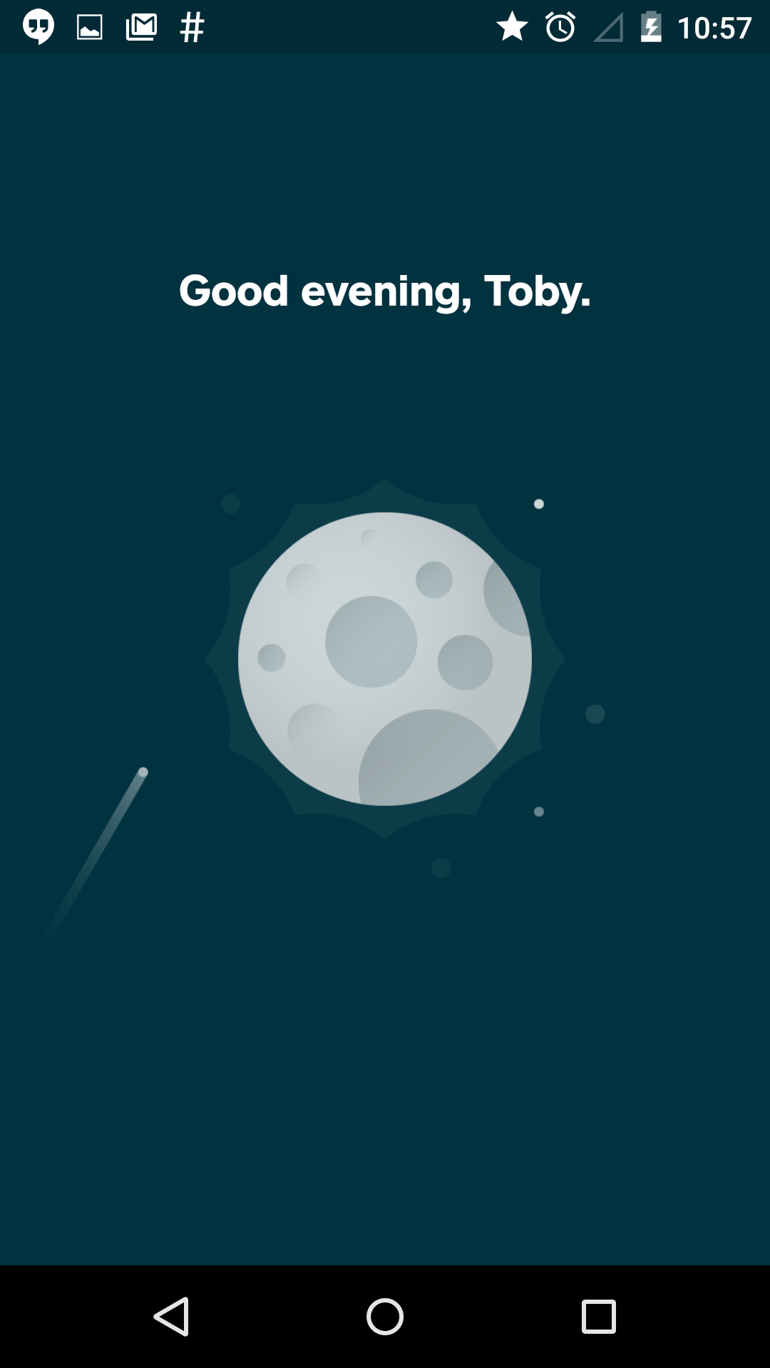
Square order is an example of this respect made manifest - and time is only one of the numerous ways it delivers a superb experience. Instead of a dull splash screen, Order greets the user by name and offers three different animations and color schemes depending on the time of day. The simple act of welcoming the user back immediately personalizes the experience and lets the user know it’s all about them. In fact, language throughout the app is friendly and helpful, yet concise and communicative.
Its animations are understated, smooth, and appropriate. There are no nonsensical screen pushes, randomly appearing dialogs, or awkward transitions. The whole experience of navigating and using the app feels like a logical, directional flow of information. It also has excellent pacing. From the introduction to the app, in which you can see a miniature version of someone navigating around, to the animations from view to view, to the purchase confirmation - all have been optimized to be incredibly satisfying.
And finally, Square uses other aspects of technology - WiFi and Bluetooth - to allow the user to simply act on their own pace as they walk to the store to pick up their order. The entire experience is designed end-to-end, with any awkwardness mitigated by the product itself. Square Order gives me the feeling that its designers didn’t think of users as users, but simply people. If there’s anything that can be called human-centered design, this is it.
~
Perhaps I haven’t articulated perfectly the characteristics I want to emphasize, but in future posts, I will. This blog is about identifying the things that make our products human, the values beneath the pixels. We are are capable of making better things.
Lastly, although as a field we can look to Order as an inspiration, I think it’s important to note that the consumer tech space is currently facing greater philosophical challenges: what sort of products and services should we be building? Ultimately, Square Order solves only Western consumer problems by providing convenience and immediate gratification. I hope to see more products at the intersection of progressive, human-oriented design and positive social contribution.