Notifications on iOS and Android
In the first entry in this miniseries on notifications I touched on:
-
Notification overload
-
“Dumb management” characterized by a lack of automated filtering
-
Logic for different information categories
-
Lack of ability to access previous notifications causes unmanageably crowded notification centers
This time, I’ll show how notifications are handled on the relevant platforms and the limitations therein.
After a long relationship with Android, I picked up an iPhone 6 in November. I’ve since become hyper-aware of the difference between Android and iOS’s notification logic.

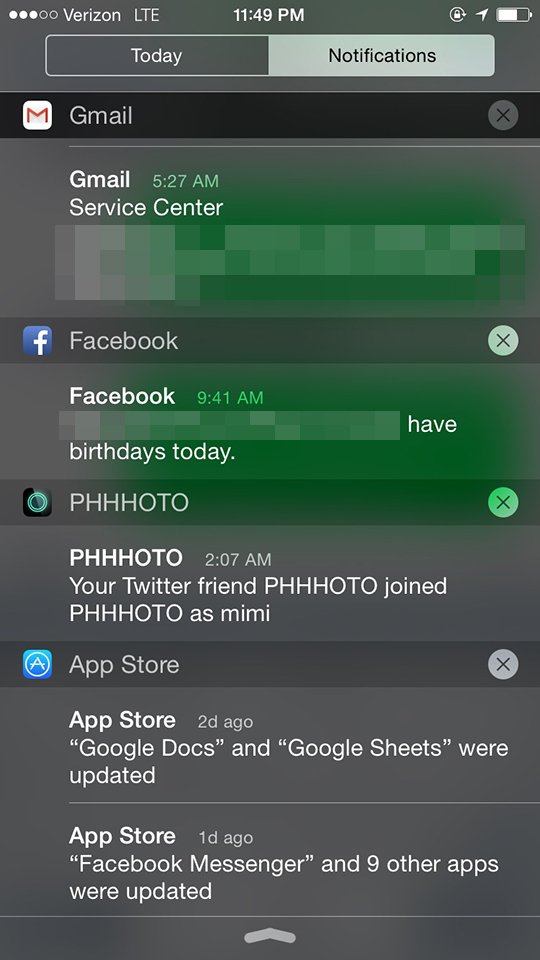
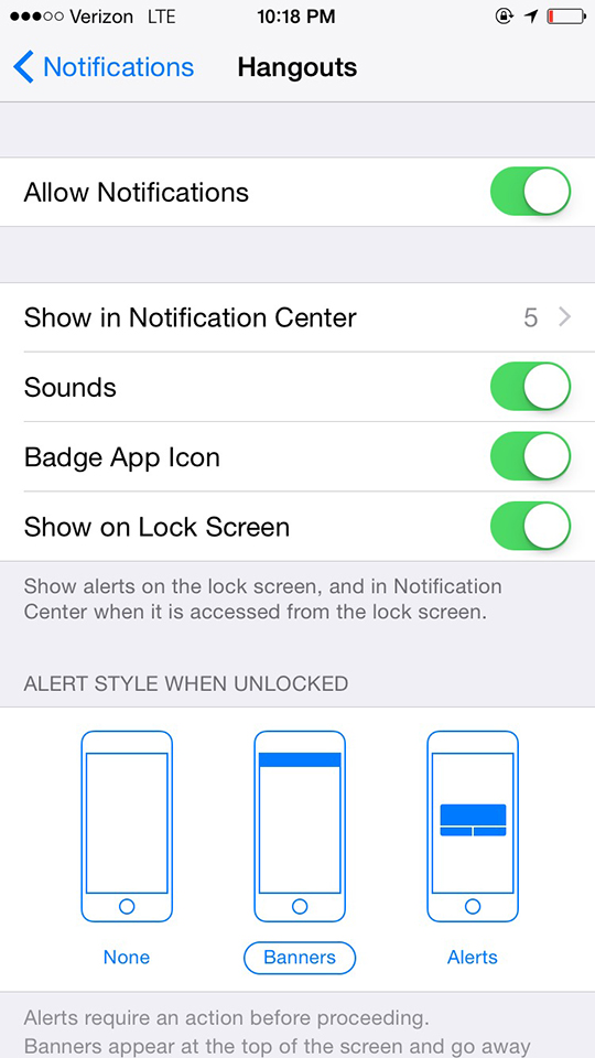
iOS’s system-wide notification management center is somewhat lackluster. It’s one long list of all your apps, and for each, the options seen above. While you can turn on and off the sound and lockscreen alerts, the only meaningful option here is disabling an app’s notifications entirely. While iOS’s Do Not Disturb mode prevents notifications from vibrating the phone, it doesn’t change what actually populates the Notification Center. The result for most users is a Notification Center stacked with lots of notifications not currently relevant.

Moving onto Android. Over the last few years, much ado has been made about Android’s notification handling. As a longtime user, I can vouch for the fact that notifications with integrated actions, expandable notifications, grouping, and bulk dismiss make for a more efficient and user-friendly experience than the iOS implementation. Notification Center’s poor usability is worth further exploration, but I’ll stick to the topic of system-level notification mangagement in this entry.
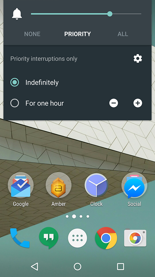
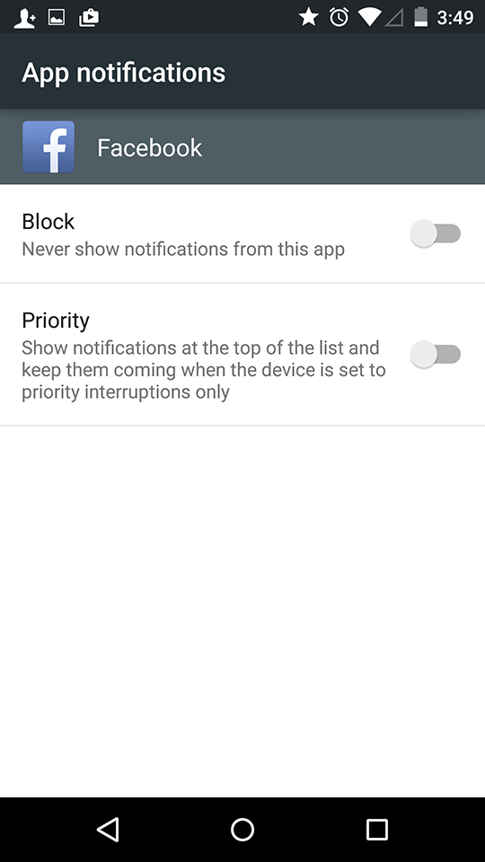
In the past, notification settings could be found in each individual app. This is still the case, but Android 5.0 also includes a unified location to change notification settings for each app, in addition to a new Priority Mode. Priority Mode sounds like a cousin of Do Not Disturb, but Do Not Disturb is really just a fancy way of of saying “Silenced.” Priority Mode gives you the ability to select which apps display notifications when Priority Mode is turned on. Priority-enabled notifications continue to vibrate the phone and are sent to the top of the notification panel, while everything else is muted for the duration that priority mode is on.

I find priority mode to be useful to leave on by default, as only alarms and notifications I’ve opted into appear. To make a comparison, iOS’s notification management is all or nothing.

Android’s whole notification experience is more robust and works fine for everyday use. But ultimately, its most clear advantages like expandable notifications and bulk dismissed are geared toward managing notifications that already appeared on the phone. The cognitive burden of managing notifications is mostly put on the end user. Priority mode does help to curb the problem of volume, but it’s more of a power user option.
How Inbox by Google Does Notifications Right
To close out this article, I want to leave an example of notifications handled really well. Previously I mentioned that email clients generally do a good job of helping users access large quantities of incoming information. A number of entities have tried to improve email with even better ways to manage this in the last few years, but I think the Gmail team is approaching the problem more correctly than anyone else. Looking at updates to Gmail in the last 5 years points to a deep awareness of the problem of different types of content in the inbox. Beginning with the introduction of the poorly received tabbed inbox, subsequent updates have seen modest progress toward automatic email categorization.
Inbox by Gmail, released into beta last fall, utterly nails it. Inbox automatically bundles emails into the default categories Social, Forums, Promos, Purchases, Updates, Finance, and Travel, and allows users to create and organize categories themselves; Inbox also learns when you categorize by yourself, eventually taking over for you. Moreover, Inbox for iOS and Android only notifies users when a high priority email or one that can’t be categorized arrives. The accuracy of this feature is very high - about 95% of the time, notifications from Inbox are from actual people writing me directly. So far, no important messages or conversations have been lost to the automatic categorization. Threads can also be pinned or marked as low priority.
The result is an email that is perfectly suited for actual user behavior. With automatic and user-guided categorization and options for category notifications, you only have to be notified about emails you want to receive. Since I started using Inbox as my daily email driver, I’ve checked my email less and less, but maintained confidence that I’m not missing any important messages.
It’s important to note that Inbox succeeds not only because Gmail has been learning from billions of data points over the last several years, but because as a user you can manually aid the categorization algorithms as well. I’ll touch on this again in my next entry. I believe a similar technique could be applied to mobile notifications themselves. I’ll present this potential solution in Part 3 of this series.
