Aesthetic was an under-appreciated dimension of the 2016 presidential race despite being a significant contributor to the shock that accompanied the election’s conclusion. “How,” design-sensitive leftists and moderates alike bemoan, “could Trump’s horrible gaudy taste have won?” —the implication being that Jennifer Kinon’s geometric, devoutly modernist logo for the Hillary Campaign was the proper aesthetic choice.
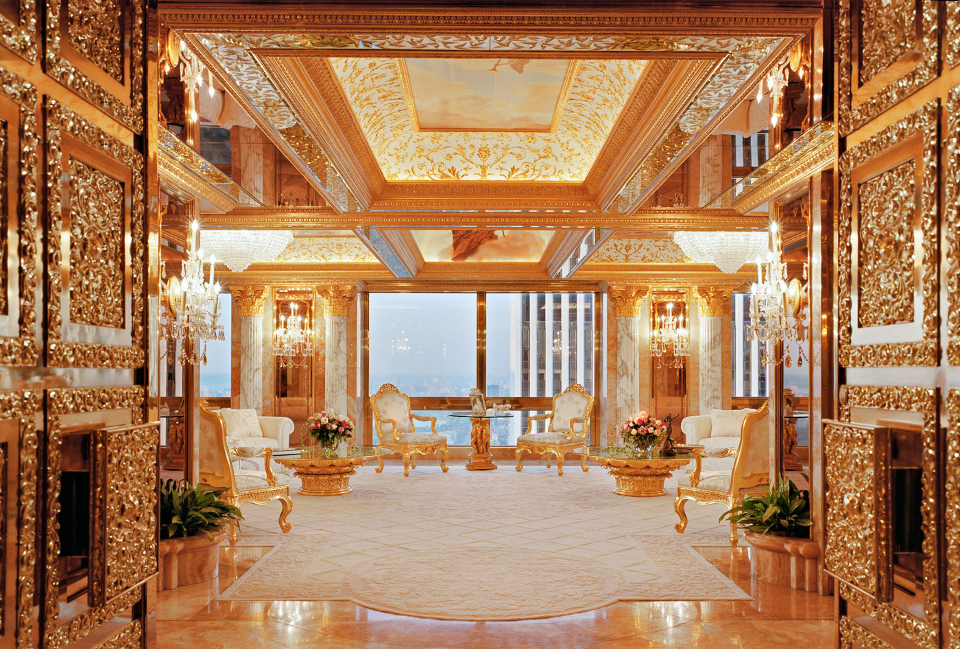
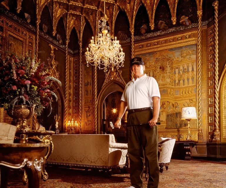
It was surprising indeed that a country known for promoting and exporting the modernist vision, a country where “mid-century modern” furniture is the default decorative style, could elect a president whose aesthetic is so at odds with its mainstream design culture. After all, aesthetic signifies class like nothing else. And Trump’s apartment, wrought with gold and marble and all sorts of intricate details, screams “I am tremendously rich and unthinkably powerful” (writes Peter York, the leading expert on the decorative taste of dictators). Not the sort of person one imagines a blue-collar, hard-working American would elect.
But elect him, they did. Let’s suppose there’s something to this decision. Psychological analysis of the decorative appetite of rulers, actual or wannabe, may account for Trump’s taste. But if we are to take Trump’s election as a wake-up call, a sign of the times, we ought to apply that thinking to the Trump aesthetic. Is this overly decorative style a standalone phenomenon?
–
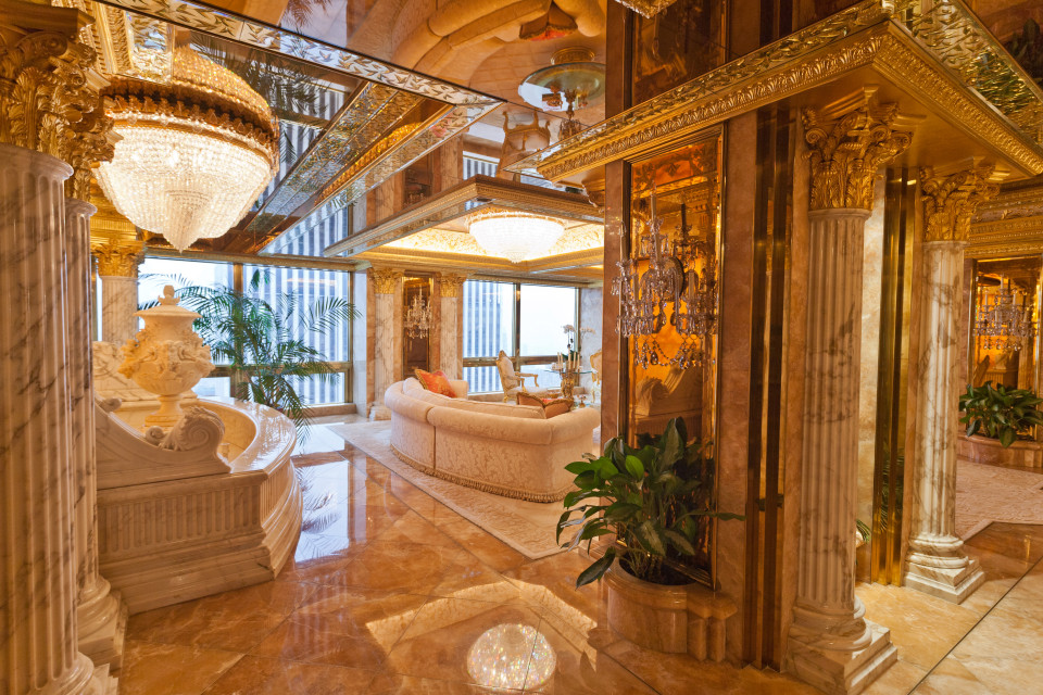
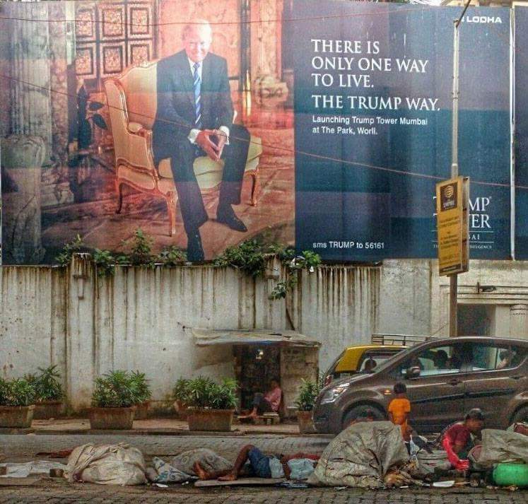
A look inside Trump Tower in New York and we’re greeted with marble and gold. Intricately sculpted moldings and gilded fixtures, everywhere overt symbols of wealth. Everything is shiny, reflective, and glistening with the sheen of money.
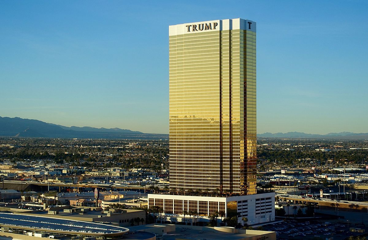
The facades of his hotels are less ostentatious, with the exception of the gold-clad Trump International Las Vegas. It’s the interiors, with their associations to the “Trump lifestyle,” that are wrought with overwhelming detail.
Only a few blocks away from Trump Tower is 41 West 57th street, the site of a proposed residential skyscraper by Mark Foster Gage Architects.
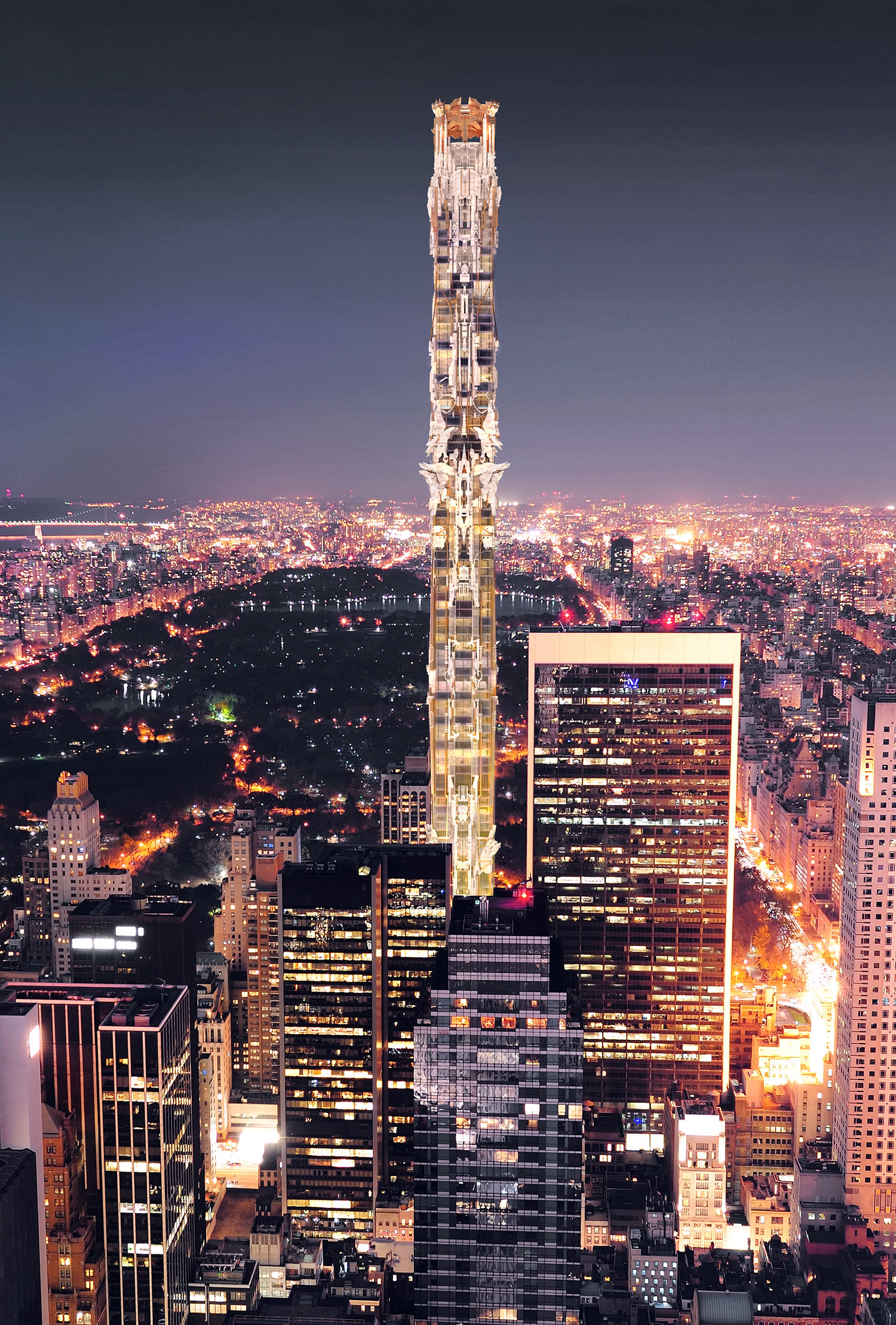
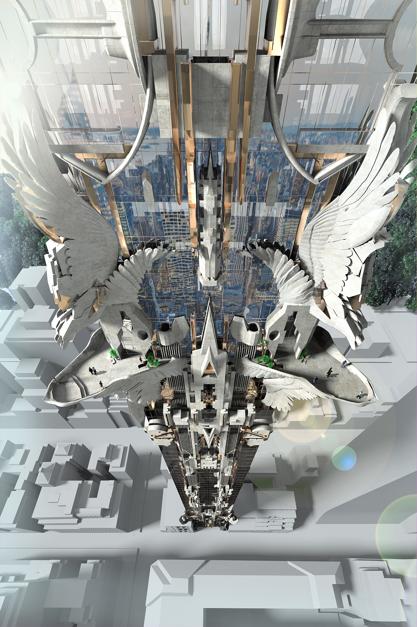
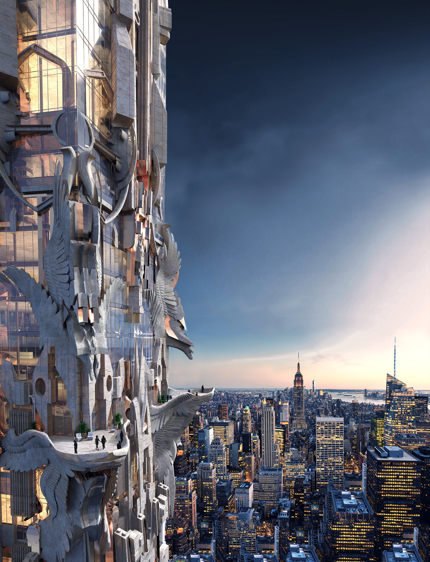
At a first glance, 41 West 57th street looks like what might happen if you turned Trump’s office inside out. There’s so much going on here that it defies evaluation. Intricate stone designs, angelic figures, odd geometric proportions, all sorts of mixed materials and cantilevered extrusions make it feel distinctly unnatural. Aside from being an obvious challenge to the NYC city skyline at 1,492ft, it deeply violates conventional architectural form languages. MFGA has committed a sort of sacrilege here, mixing traditions from art deco formalism to gothic grotesque.
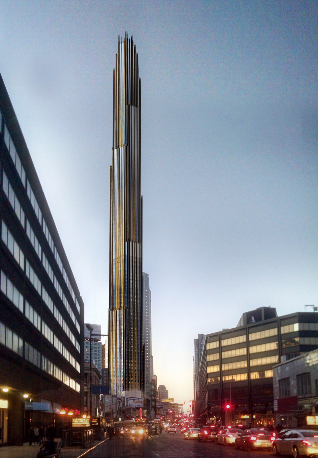
MFGA isn’t the only one up to something. From less speculative design house SHoP comes 9 Dekalb Ave, a residential supertall skyscraper built out of the historical Dime Savings Bank in downtown Brooklyn.
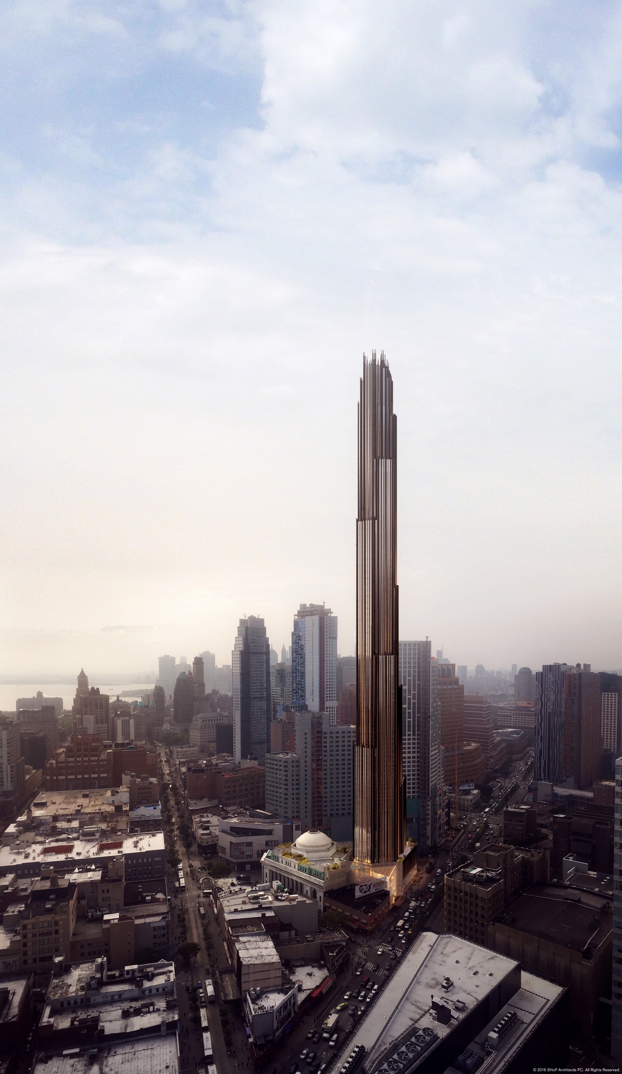
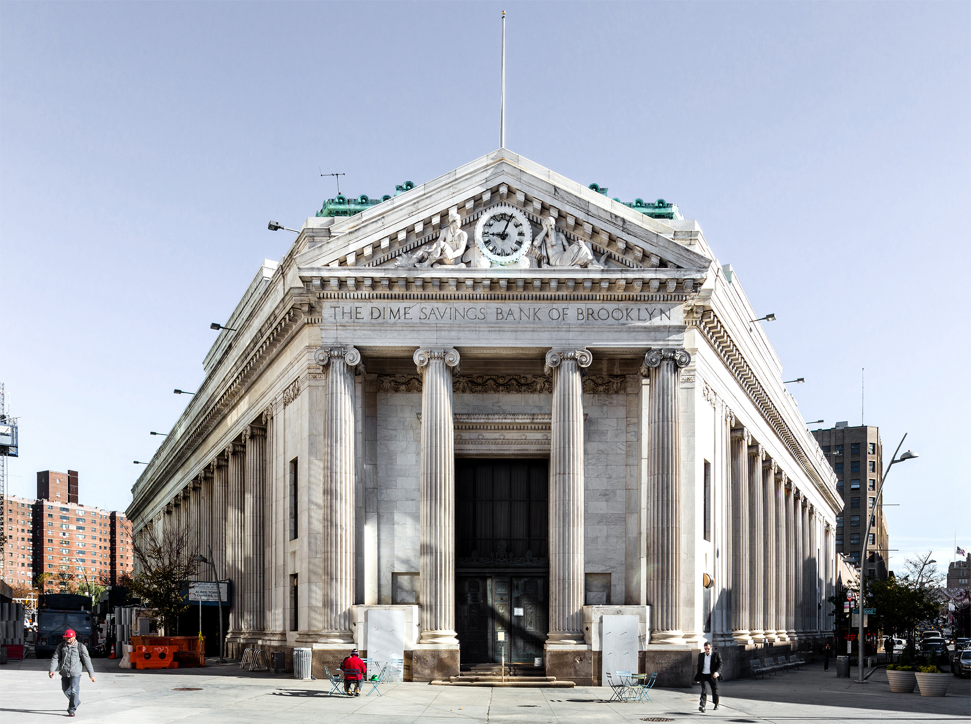
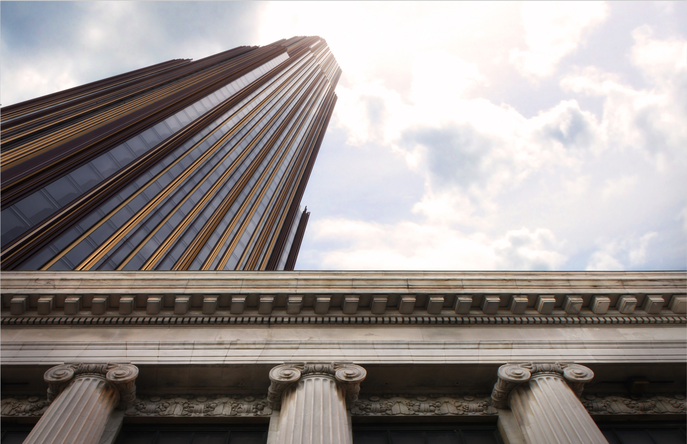
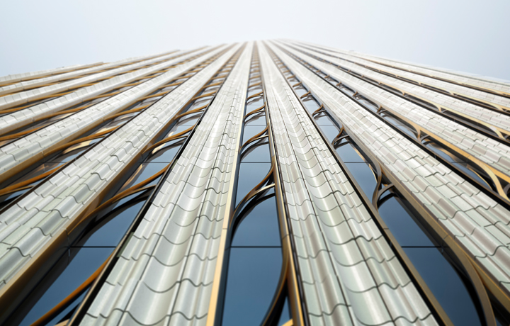
This tower takes the neoclassical stylings of the original building and runs wild with them. The pronounced fluting on the columns extends upwards into clusters of geometric shapes in different materials.
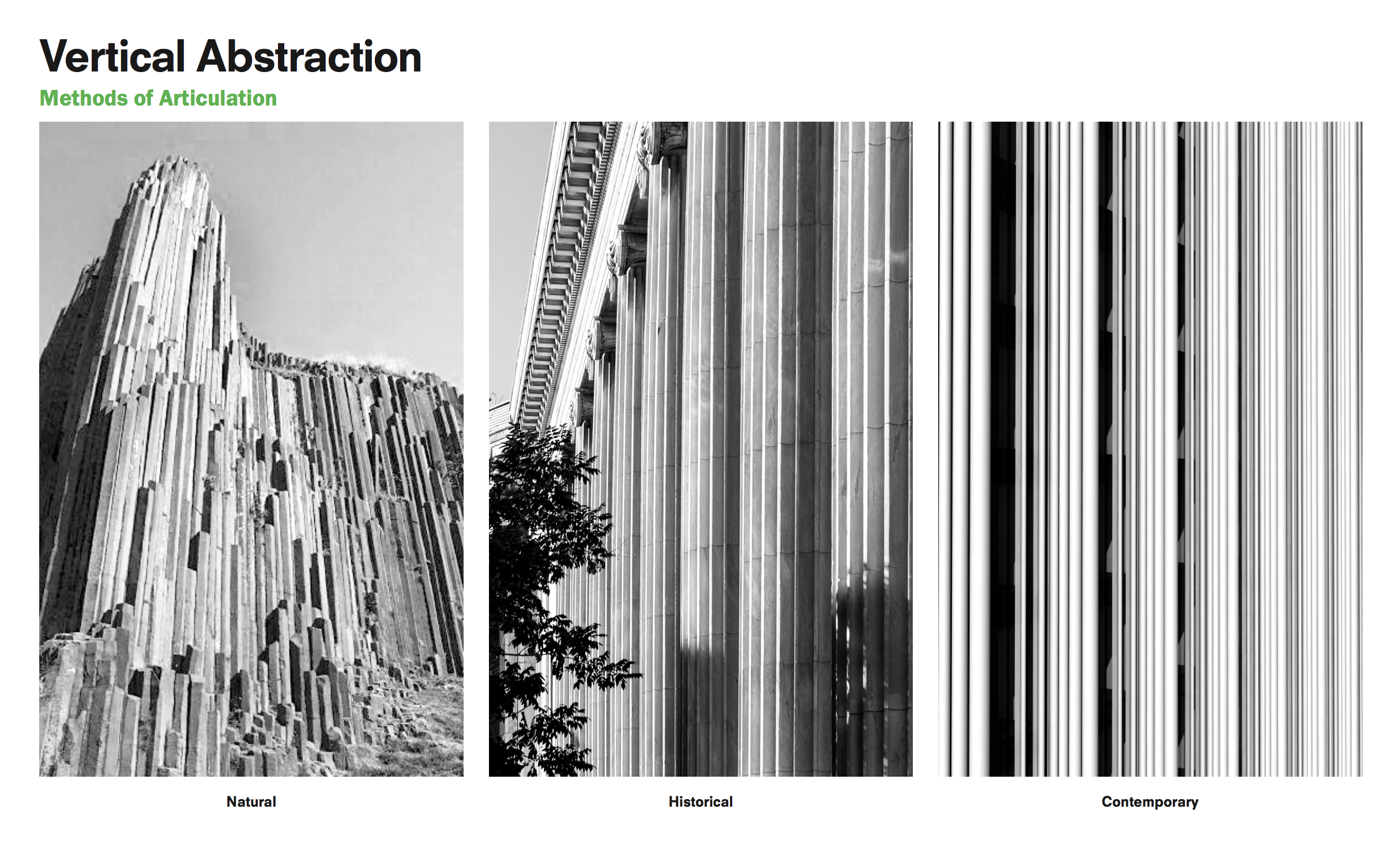 From SHoP’s 9 Dekalb Ave presentation, available in the bibliography on Are.na or through the NYC Landmarks Preservation Committee website.
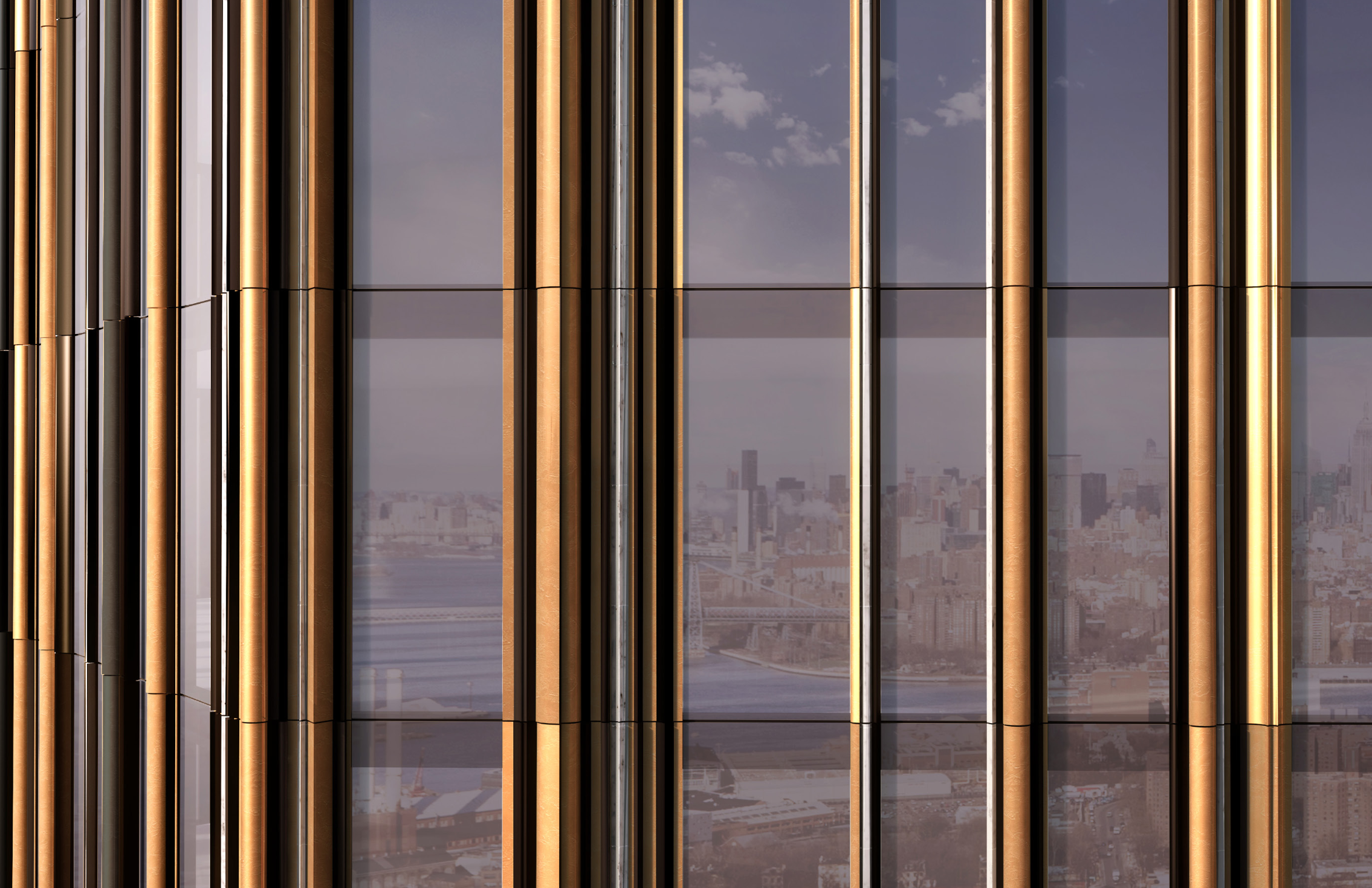
The composition of materials changes as the building rises, from patinated bronze to an unidentified blackened metal, adding dramatically to the tapering effect. The resulting look is wildly different from other supertalls. It’s not just a wall of reflective, bluish-tinted glass, and it can’t be said to look “modern” in the sense of the International Style nor in the Koolhaas / Zaha Hadid style of smooth, parametrically determined curves. It’s not exactly art deco either. Its decorative ridges and ominously precipitous form, completed by what look like triple-spiked parapets, have the imposing feeling of gothic architecture.
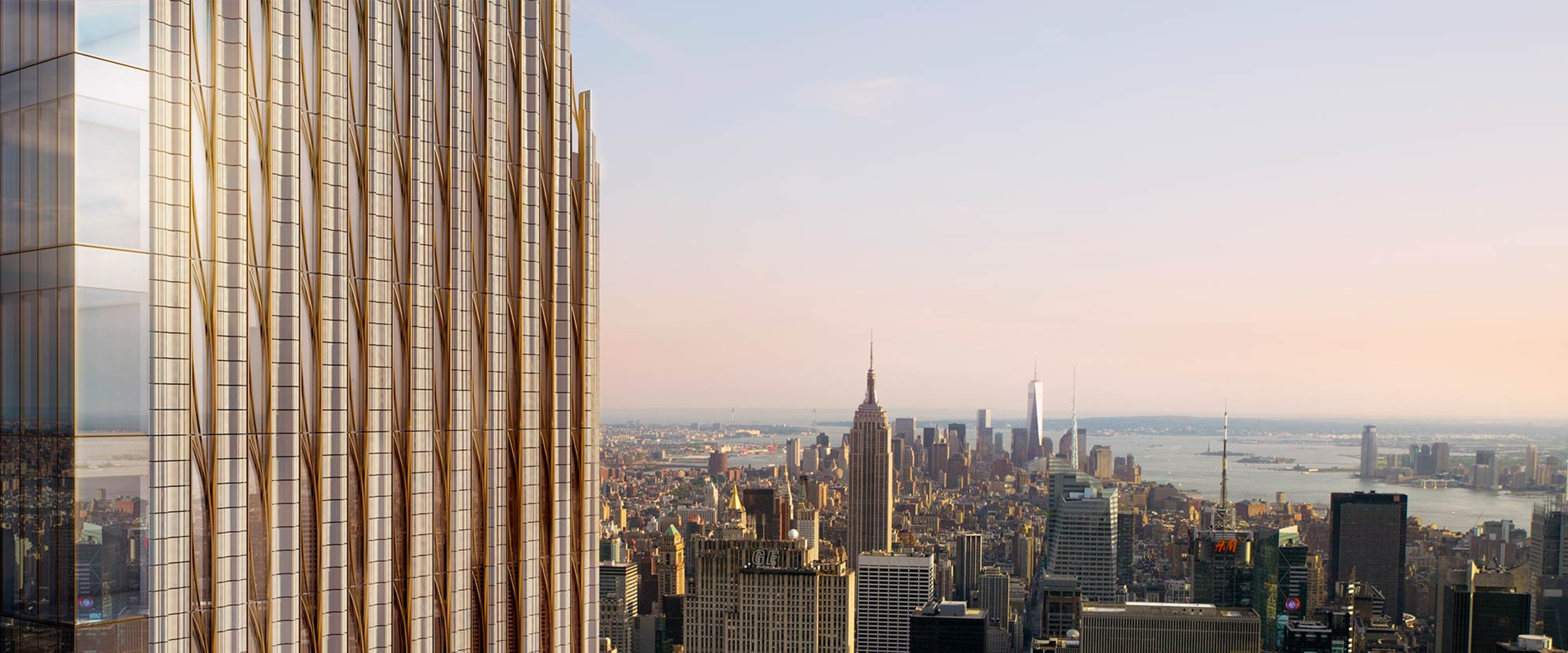
SHoP’s 111 57th Street carries some of the same references and is done up in a lighter terracotta and gold.
–
What is going on here? Trump is simply expressing his wealth as only an insecure egotist can do. He lacks the verbiage to describe things in other words than “big” and “beautiful.” Mark Foster Gage, on the other hand, has a more nuanced angle. In an early published paper, “Etiologies of Beauty,” he advocated for buildings that produce the sublime, which in art theory is that very monstrous sort of beauty that is both awesome and horrible. “Monstrous” is a fitting word for Gage’s buildings. Most of them do share features with gothic architecture but are less rigid. Some look nearly biological, as if a human could not possibly have conceived the shapes. Others have layer upon endless layer of patterned segments.
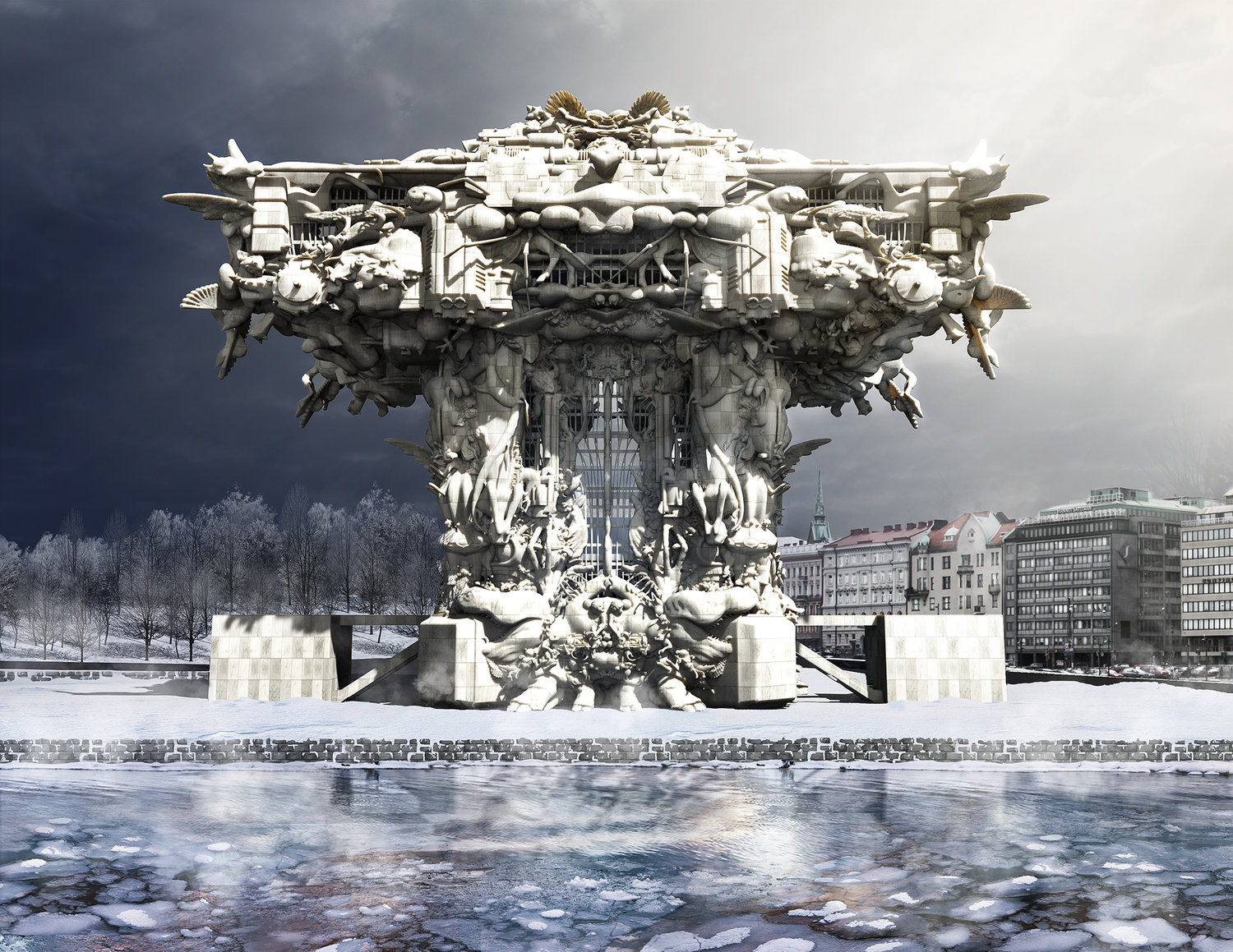
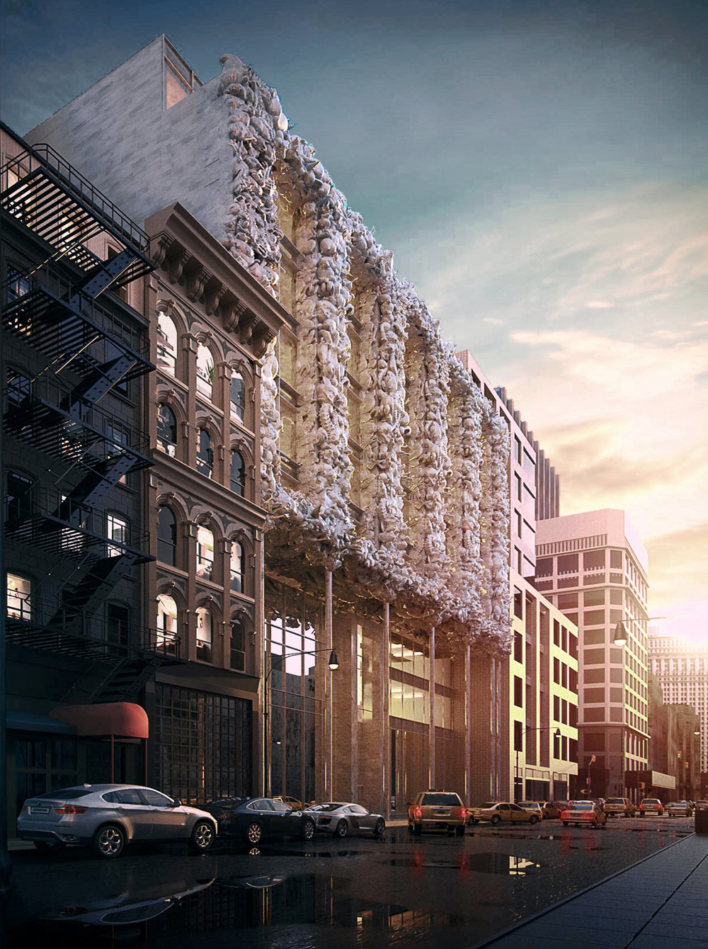
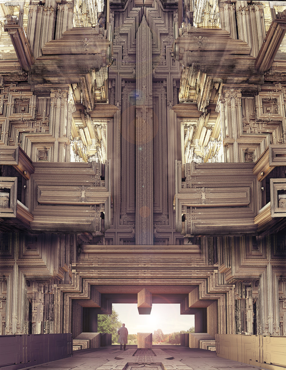
Gage rejects the “paralyzing” nature of critical architectural discourse and “scientistic” justifications for design language, such as mathematical principles and calculated space efficiency, optimizing for visual beauty instead.
An interview with SHoP partner Gregg Pasquarelli reveals his firm has similar inclinations. The partners founded SHoP together on the premise of marrying aesthetic beauty and technical innovation. (It is revealed in the interview that Pasquarelli was a former investment banker who spent his time daydreaming buildings. Maybe all architectural fantasies are outlets for the banality of surplus capital.)
–
While outlining this essay I struggled to come up with a term that appropriately characterized the aesthetic goulash we’ve been working through. Some of my ideas were: metagaudy, extraclassical, neodecorative, superornamental, accelerationist classical, and Trumpwave. I posed the question to some online acquaintances and Desmond Wong came up with “Baroque Capitalist.” It certainly has a ring to it, and I was sold after @DreamboatSlim perfected the explanation:
@tobyshorin @gneghevt @desmondhwong ridiculous excess which is (or at least appears) structurally unsound. Yes
— Heraclitus (@DreamboatSlim) March 8, 2017
These buildings and their hyper-stylized forms are physical manifestations of money. Our examples have been luxury apartment buildings; one on Billionaire’s Row with wildly superfluous ornamentation, the other literally busting through the top of a historical bank (now a branch of Chase, of course). These towers do not so much suggest as directly characterize the imposing force that is capitalism as it overshadows contemporary social space.
Now, I had noticed the connection between MFGA’s 41 West 57th Street and the Trump aesthetic late last summer. But I more or less forgot about it until a few weeks ago, when I read a 2013 e-flux piece by Gean Moreno, “Notes on the Inorganic, Part 1: Accelerations.” Moreno looks at the lasting popularity of the so-called “grey goo” problem, an imagined scenario in which self-replicating, biovorous nanobots consume the world, leaving behind nothing but a gray sludge of nano-material. He notes that the nanobots are evocative of another non-human entity: capitalism as an “Alien monstrosity, an insatiable Thing that appropriates the energy of everything it touches and, in the process, propels the world toward the inorganic.”
Something clicked when I read this. The pure expression of capital was exactly what I had been thinking about, but unlike Moreno’s “slimed and dead world” I was noticing the twisting forms of MFGA, the “encrusted” capital inside Trump’s offices, and the seemingly self-powered explosion of 9 Dekalb Ave out of the Dime Savings Bank. Accepted as a creative point of origin, it turns out that capitalism still subsumes everything. But it does so by blossoming into evermore absurd stylistic forms, intricate angel sculptures, and shimmering copper cluster columns.
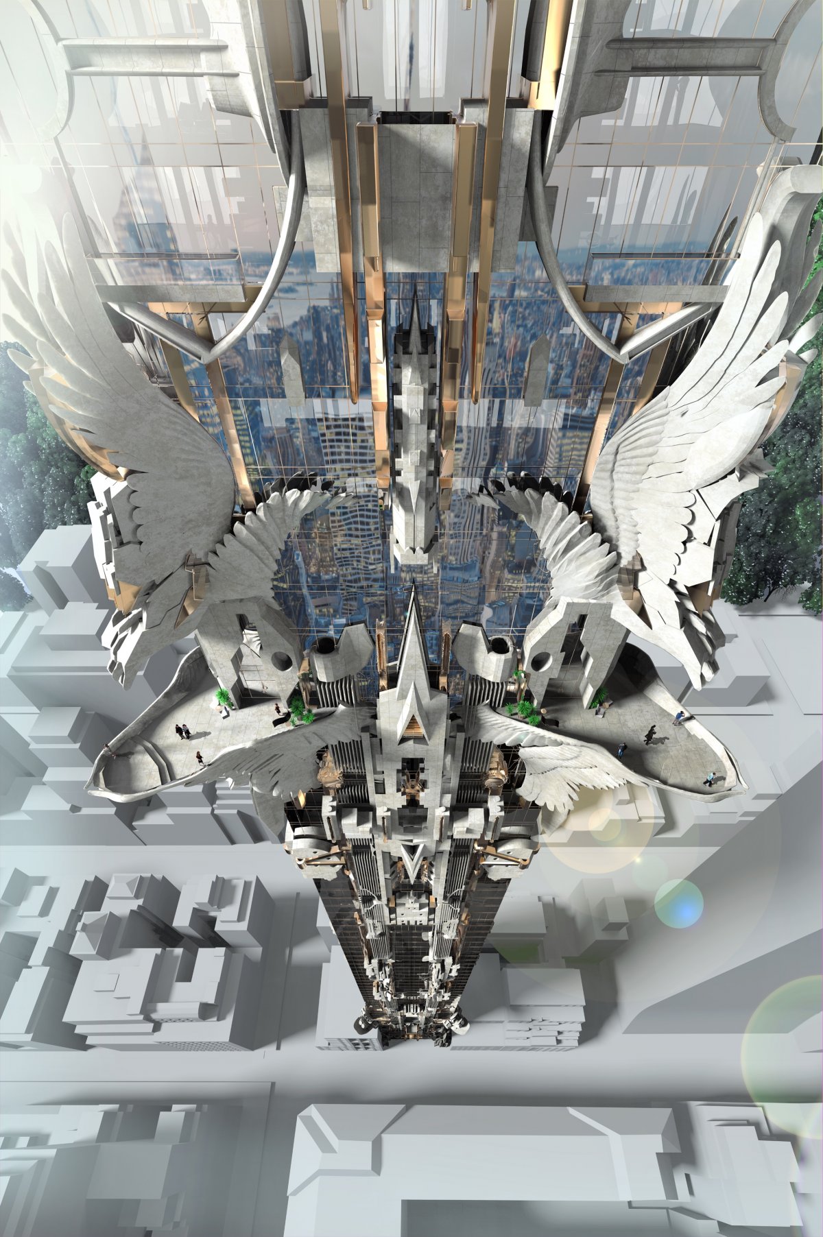
“In our office discussions we thought that such a significant luxury building deserved more than just being yet another glass or steel modernist box. Those are 20th century ideas, and while they have served architecture well, our cities citizens, and the residents of such buildings, yearn for and deserve more. You can see evidence of this in the astounding success of buildings like Robert A.M. Sterns 15 Central Park West building in New York. Our design is taking this type of financial success and updating it for the 21st century… It’s fairly commonly understood in most industries that beauty translates into money— we’re bringing such thinking back into architecture and development.” Gage as quoted by ArchDaily, emphasis mine.
Moreno’s piece also confirmed my hunch that there was something accelerationist about this aesthetic. As our friend Dreamboat reminds us, capitalism’s foundations are crisis-prone. Accelerationism responds to this shakiness with the provocation that the only way through the capitalist era is over its expired body. Accelerationists like Moreno more or less believe that social change, facilitated by technological progress, can leverage the capitalist model to build new social and economic infrastructure and transcend the vicious austerity cycle we have now. They reject the nostalgic return to the past era of “stultifying boredom and social repression” and call for a left sociotechnical hegemony.
The accelerationist movement and baroque capitalism mirror one another. Baroque capitalism supersedes other styles not only because it’s more visually arresting. It’s also more philosophically advanced than older intellectual stances and their accompanying aesthetics. The baroque capitalist style rejects the modernist formgiving process, which imposes restrictions on form and style; and it rejects critical architecture theory, which fundamentally opposes the growth and exploitative nature of capital. Baroque capitalism is the opposite of luxury minimalism. Instead of hiding visual decoration, the Trump aesthetic embraces it to the fullest, losing all semblance of rationality as intricate golden forms bloom forth.
In architecture, it’s an experimental aesthetic method that embraces and encourages capital. In another essay, Mark Foster Gage states explicitly that a clearer focus on the “sensuality” of buildings can bring attention to the problematic nature of the architectural field. Perhaps something like his ludicrous 57th street design could point out that without this ornamentation, a “naked” glass building still serves only the interests of developers and buyers with huge amounts of money at their disposal. This would certainly be an accelerationist approach.
–
After Trump’s election, accelerationism seems to be going mainstream among left-progressive political thinkers. The election has ushered in the adoption of this new theoretical stance, and with it has come what I suspect will be a sleeper aesthetic macro trend. This haute baroque capitalism is maximalist, super-ornamental, and takes capital as a first principle.
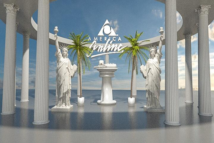
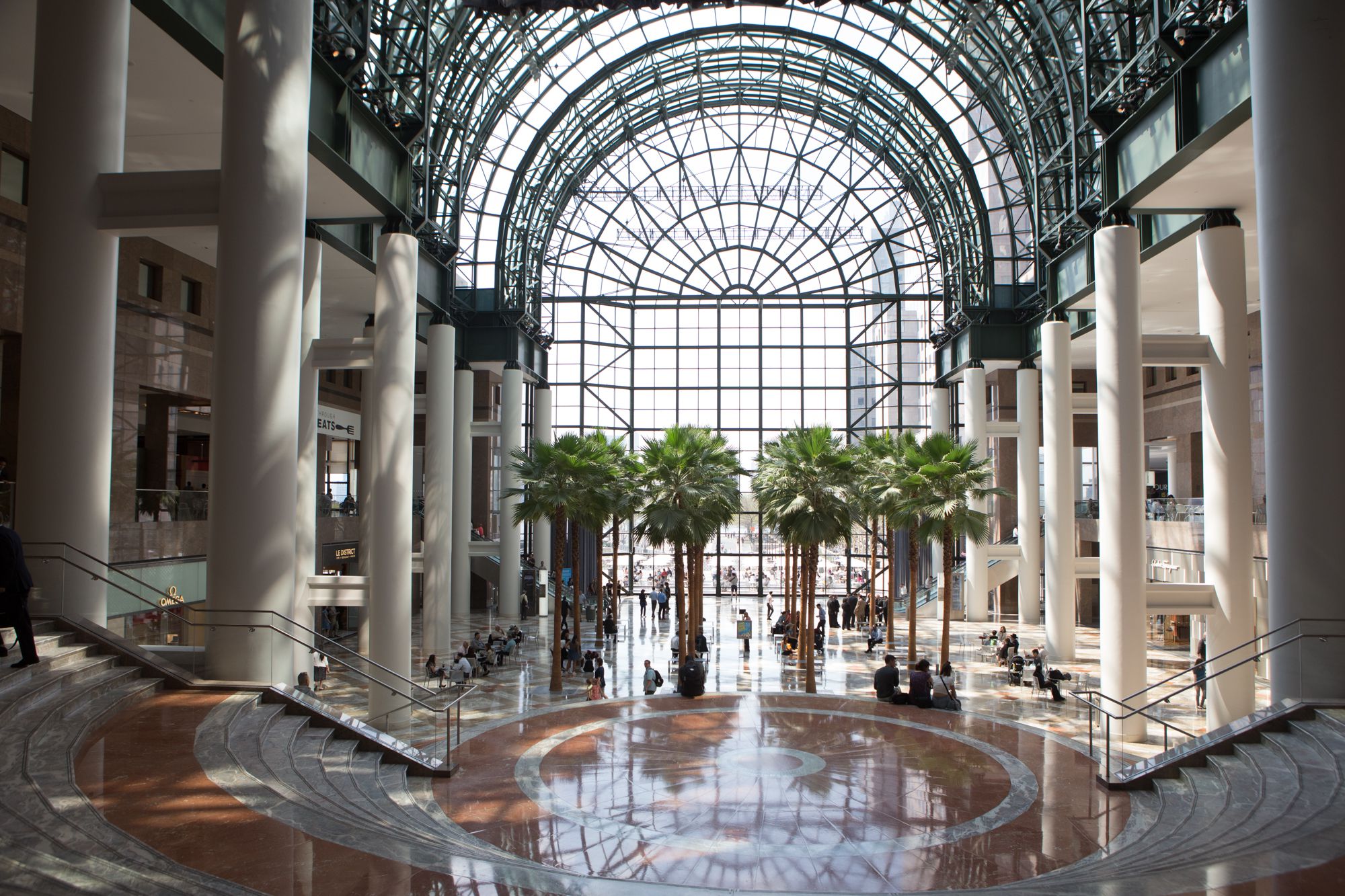
If I’m right about baroque capitalism, we should be able to find early examples of it wherever else visual culture is highly concentrated. Accepting the aesthetic as a generative and formal expression of capital sheds some retrospective light on the vaporwave phenomenon, which can be seen as a precursor to baroque capitalism. It shares many of the same sensibilities in terms of using physical manifestations of capital as an expressive tool. But vaporwave considered capitalism to be incapable of providing meaning. Vaporwave attempts to show the lifeless, dead shells of consumer “culture” that capital has left behind. Politically, these empty luxury objects and urban spaces aren’t too far off from Gean Moreno’s grey goo critique.
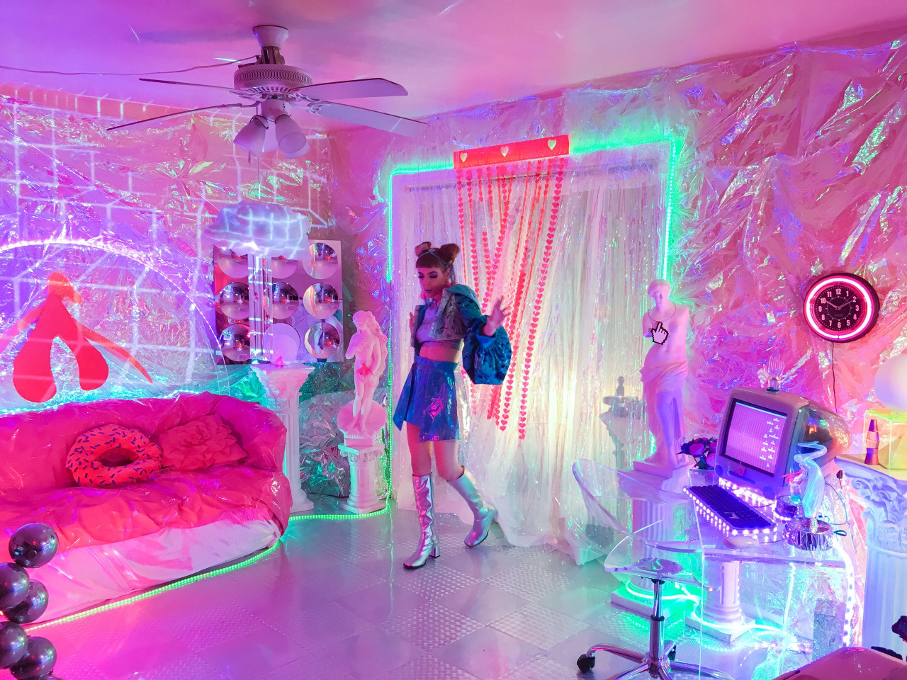


Note how stylistically similar some of the visual elements of vaporwave and baroque capitalism are: luxurious cosmopolitan settings and consumer objects presented as such. Vaporwave, however, could never become an architectural style. It remains a satire, an endlessly-recycled in-joke, because its forms are the endpoint of capitalism instead of a starting point.

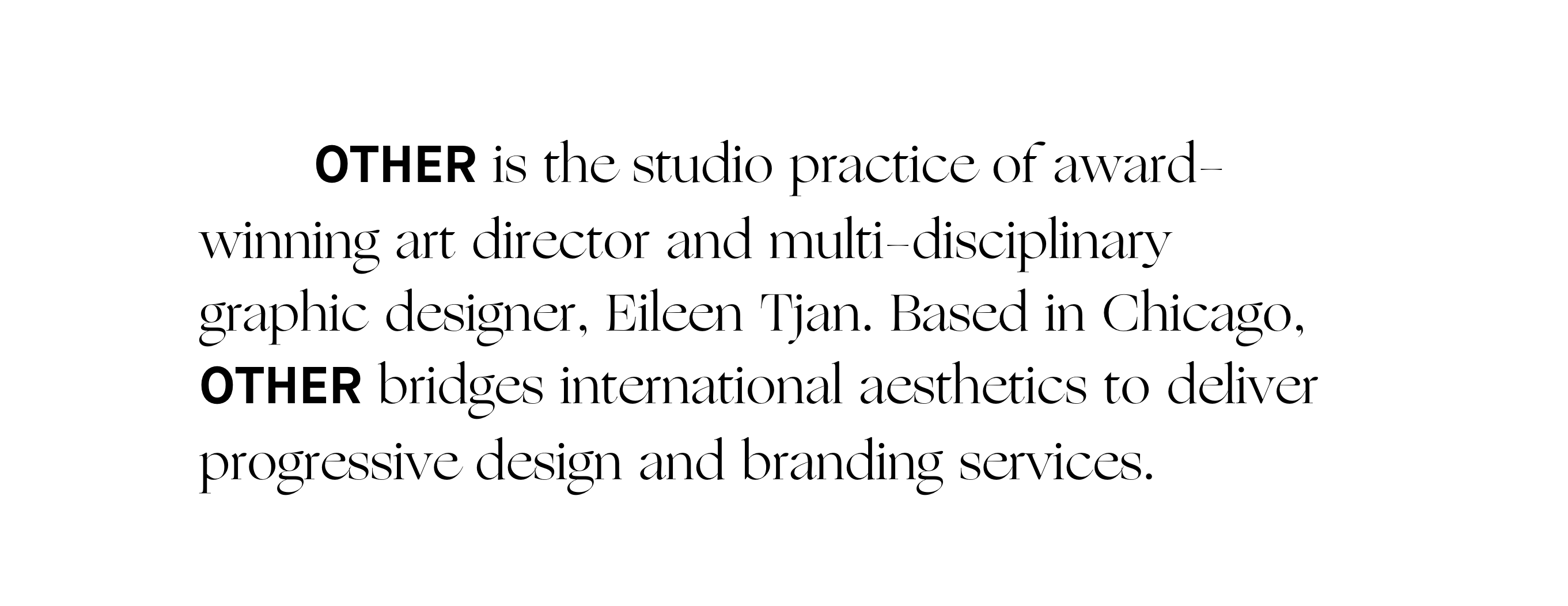
Graphic design too has been inching toward an accelerationist aesthetic for some time. If you’ve paid the least attention to graphic design, you will have noticed that spindly, accentuated serif typefaces, what can only be considered typographic “neoclassicism” are very in. It’s a clear departure from the geometric sans serifs that have dominated the visual landscape for the last 10 years. Commercial Type’s Canela typeface employed here by Adam Pellecchia and Village’s Ogg typeface as utilized by Alright Studio for Eileen Tjann.

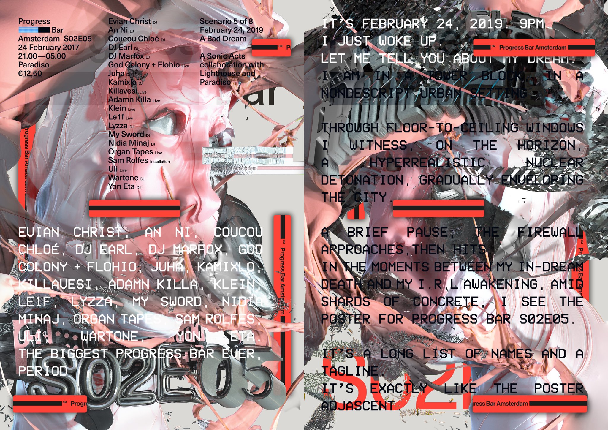
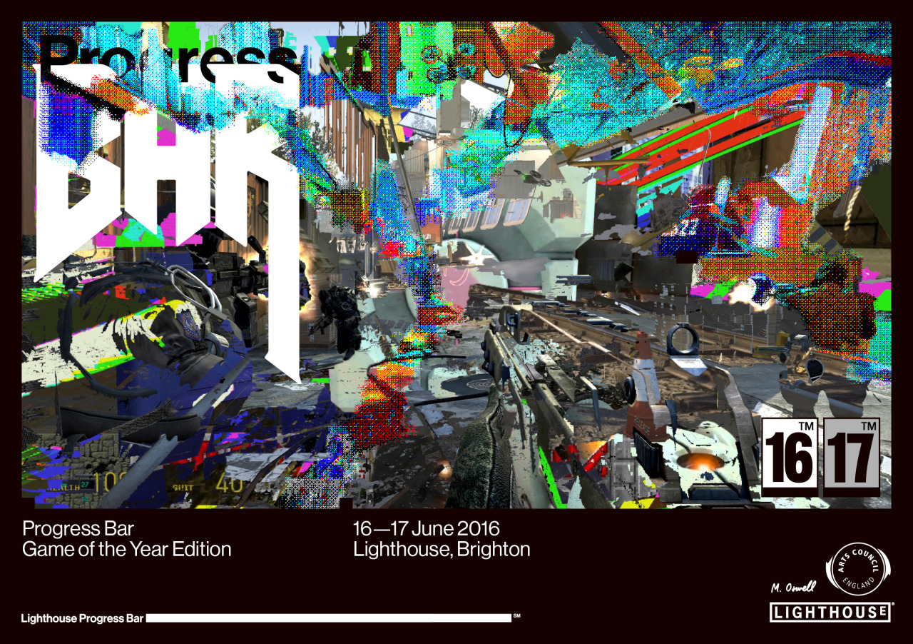
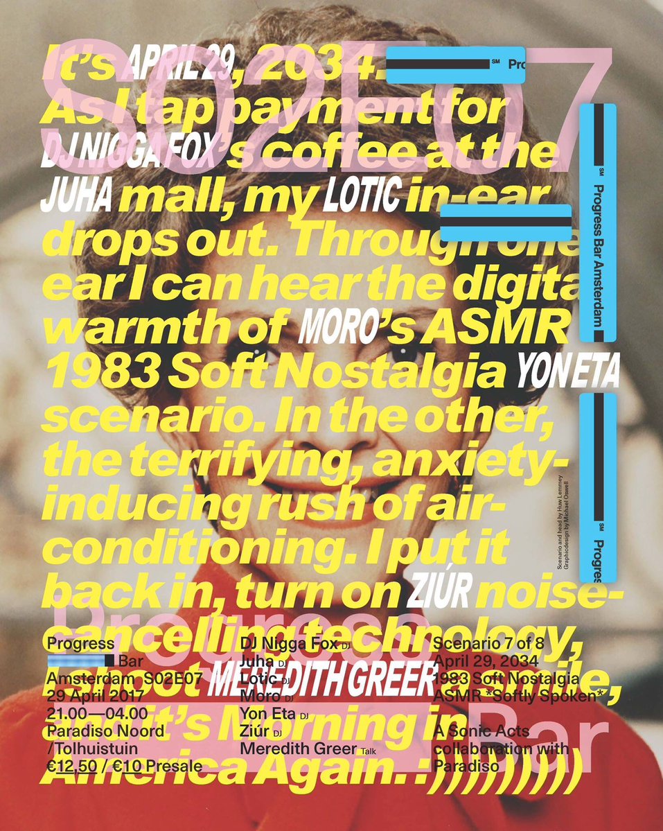
When it comes to marrying aesthetics and politics, the lowest hanging fruit is Progress Bar, an art house / think tank / nightclub which is rather publicly left-accelerationist, having hosted prominent accelerationist thinkers and pushing a techno-utopian agenda. Its graphic design is done primarily by Michael Oswell. His style could not be said to be “decorative” in a fussy classical way. Yet it uses typography and text, the primary elements of graphic design, as ornament and the result certainly is visually overwhelming.
Minority and working class people need to take left- accelerationism away from graphic design fuccbois in Helsinki
— ANON (@ANON_LLC) February 15, 2017
A final case study is David Rudnick, perhaps the most visually influential graphic designer currently working. His instantly-recognizable style comes closest to the feeling of MFGA buildings. David’s typographic sensibility shares a kinship with 15th and 16th century typography, and he frequently designs his own custom type with intricate details that somewhat decrease legibility. His work is rich with ornamental details, spiky serifs, flowery ligatures, and club poster graphics. It can only be described as intentionally excessive. David Rudnick’s style is ‘extra.’
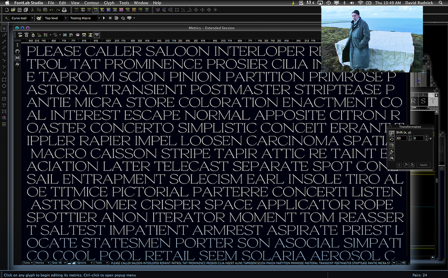
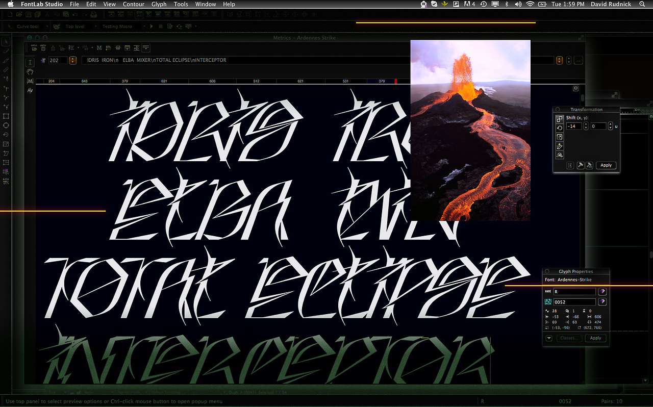
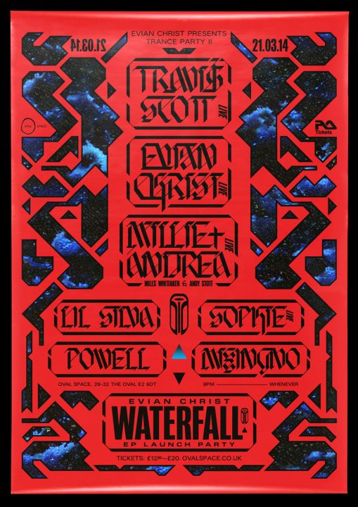
David professedly rejects the same tenets of neoliberalism that accelerationists seek to transcend. Although he does not consider himself accelerationist, he will be remembered in connection with the movement. David did not respond to a request for a comment on this essay.
SHOTS FIRE https://t.co/o8GbsWO9NG
— ཊལབསརངཧ (@David_Rudnick) February 15, 2017
–
I’ll close with some selections from “Is Aesthetics Sustainable” by Graham McKay. It’s unusual for architecture to lead aesthetic trends but as McKay points out,
Architectural aesthetics had become a consumer/aspirational item long before the 20th century. Mock Tudor buildings were being built well into the 19th century in the new aspiration of old money. Stucco came into and out of fashion several times that century but, at the end of the century we had Art Nouveau. It was in the decorative arts that its impact was felt most. If you couldn’t afford to buy the house you could at least afford the Art Nouveau teapot, the tapestry, the stained glass, the wallpaper, the chair, the lamp, the trinkets…
I expect this is what will happen with baroque capitalism in the coming decade. It will only take us a couple years for leading-edge consumer culture (which leans left) to get past the instinctive disgust the style invokes in early 2017. Trump has already made billions by turning his garish taste into consumable products and experiences. Interior design, service design, industrial design, mainstream graphic design, and architecture will adopt Trumpwave with fashion leading the way. After all:
Fashion is a highly visible and expensive consumer item. Fashion employs gimmicks of little value other than to shock. Fashion features a decadent use of materials and quantities of labour and other resources in the hope they will be impossible to replicate downmarket. Fashion has no need of history other than as a “reference” for something new. Fashion is one of the few businesses it’s believed to be not totally about the money. Fashion does not progress – it just renews itself endlessly for no particular purpose other than to provide something new for us to consume the look of.
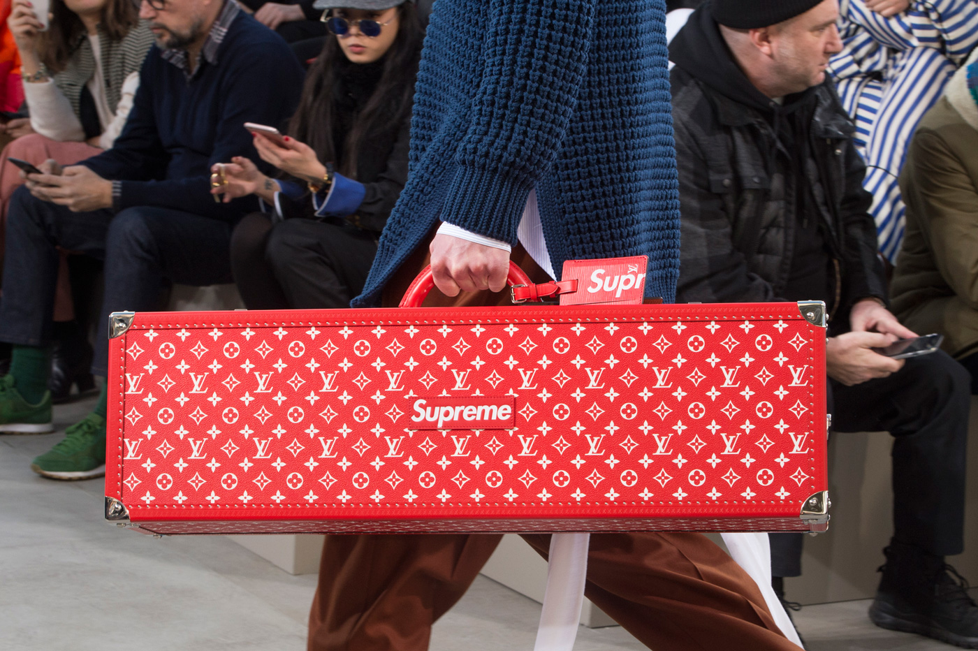
Haute baroque couture will come as soon as SS’18. And when it does, it will be dressed up as subversive and rebellious anti-culture. The Louis Vuitton x Supreme collab is a good indicator of what this will look like.
What we have now is a situation where buildings praised for their aesthetic innovation are not good in any moral sense. Conversely, buildings that try to do the right thing are criticised for not having an orthodox aesthetic agenda. It would seem that sustainable buildings are not what the world wants. Meanwhile, “the forces of aesthetic consumption” are telling us an endless proliferation of stylistic diversions is not only good for society, but necessary. The vast machinery of aesthetic production is more than happy to oblige… Sustainability as a form of moral beauty appears to be in opposition to an aesthetics of visual beauty. (Emphasis McKay’s)
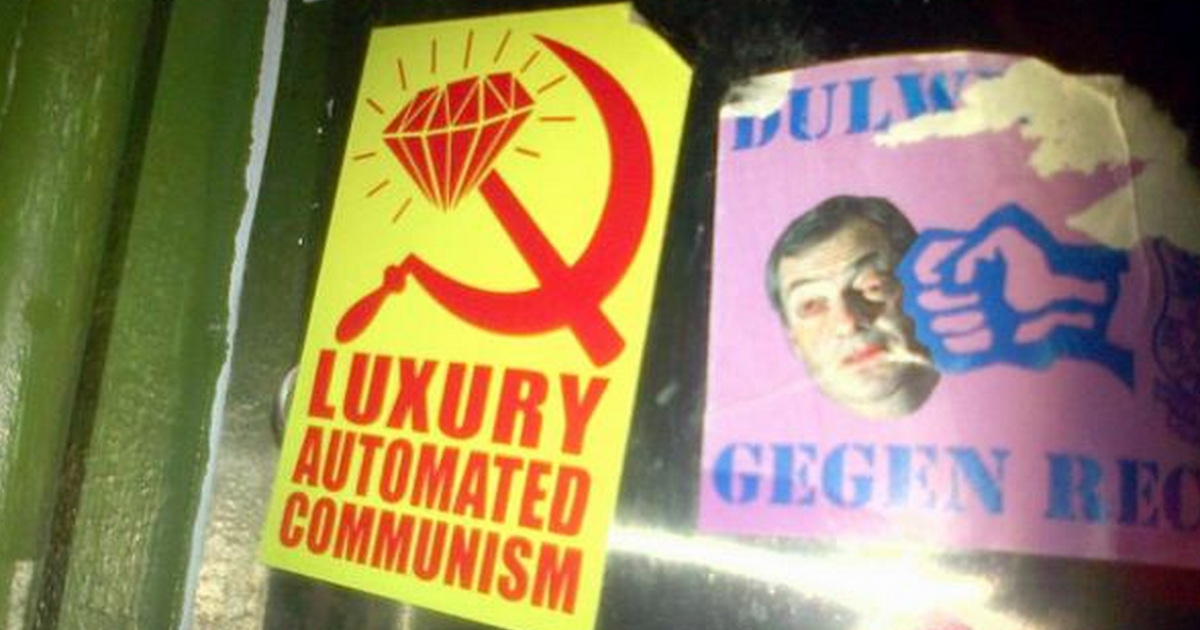
Think of “sustainability” as a stand-in for any political stance that doesn’t encourage the dynamics of debt, inequality, and economic instability. If Mark Foster Gage, bored of being critical, is an apologist for extravagance, accelerationists too are simply accepting the same old “there is no alternative.” McKay’s conclusion that sustainability and aesthetics are irreconcilable only strengthens my suspicion of accelerationist aesthetics and accelerationism in general. It seems to me that most arguments for accelerationism rely not on reason but on compelling visual metaphors. This effect will be multiplied if baroque capitalism becomes the general style of the ideology in whatever watered down version reaches the masses. “Fully automated luxury communism,” anyone?
